Harriet caught up with Jude Wood,
our super talented resident designer to chat about the inspirations and processes of Narosa design. “The approach is simple: everything starts with a functional concept, and I make it pretty”. Jude is in charge of all things visual which means she’s involved in everything that the customer sees. From the big, like the interior styling of our accommodation, to the small, like how our online retail orders are packaged, she delights in the detail.

So where did it all start?
“My design journey began in Bremen, Germany, where I studied digital media as an undergraduate. It wasn’t a specific design course, but I noticed that my focus naturally shifted in that direction, and I loved the creative side of media. Whilst studying I was always looking for opportunities to be a part of projects, so started freelancing.” “My first internship was with a design studio and it was a really creative co-working vibe. It was the first time I’d experienced teams sharing ideas and collaborating together and I loved it. With this first glimpse into the world of design I knew that was where I wanted to be. I would say yes to every opportunity that came my way and just learnt on the job. I took on all sorts of digital and graphic design like websites, CD covers, art projects & festival installations. I was really lucky to try so many different things.”

Her move to Ireland happened in 2011,
When as part of the Erasmus scheme, she relocated to Letterkenny, Donegal to study, and experience living in Ireland. Here she fell first in love with the country, closely followed by her now husband Lee, founder of Narosa who was also quick to identify her design talent. Together they developed and refined the Narosa brand. “We had so many ideas. Lee has had a very clear vision of what he wants to achieve and what ‘Narosa’ means to him since he started the company in 2008. That concept already existed but was a bit raw and needed visual help: that’s where I came in. I started with the logo, which is still very similar to the original one. I tidied it up and worked on the colours as I really wanted to make it timeless. From there I started redesigning the website and became involved in all the graphic branding details for flyers, vouchers, tags – anything printed. I then started to develop Narosa apparel, which began as simple hoody designs and has now evolved into seasonal collection drops. The small jobs all added up and with each design project that was fulfilled, the visual voice was found.” “When Narosa moved premises in 2014 the brand had a slight shift. The whole space became bigger, more professional, and the design came to reflect that. If felt like the brand grew with the location and that was exciting.”

Unsurprisingly, Jude’s main inspiration comes from the land and sea that surrounds her.
“It all comes from what we work with every day: the sea, the mountains, the colours, the vibe that we feel within Narosa, the relationships with customers. We’re friendly and relaxed but want to make it clear that we’re serious about surf. It’s a fine line to tread between fun and playful, yet still being a serious business.”

“I’m always on the lookout to see how other great brands are doing their visuals.”
“NAVUCKO, Pula Umi and Pukas are some favourites doing design really well. I take in everything around me: fashion, outdoor brands, other printing/paper goods. Whenever we go to a city I love seeing shops, book covers, street fronts, how people are doing stickering on windows and what interior styles are trending. City influences coupled with landscapes is where my ideas flow.”

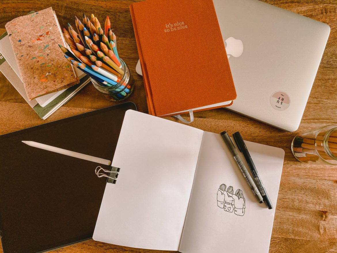
“I’m not a notebook person who’s constantly scribbling.”
I like to set time to work and when I sit down, I’m in the right headspace to create. I draw from the archives and look to old designs, photos on my camera roll and clothing that we’ve released before. I like to tweak and alter previously discarded designs; nothing is ever thrown away for good. It may need a new context or might just be the wrong time. Some things fit different purposes, for example if a design turns out a bit too fun for an adult garment, it could be perfect for a kids’ hoody”.

“‘The Captain’, and namesake of our coffee bar, has to be the most iconic of all the Narosa designs.”
“It’s super quirky and the most well received that’s ever made it onto a garment. That type of design is quite rare for me as I’m more a designer than illustrator, but that one was really special. I see Narosa design evolving to have more independence over garment and product production, rather than only on the graphics. We like to do stuff really well and are completely committed to high quality and value. We currently design our own range of balsa wood surfboards in house, Tonn. They are a unique build construction that took years of research and development to refine, and we are so proud to have produced something that is sustainable, beautiful and high performance. We’d love to see more original product design grow within Narosa.”

“Narosa is a lifestyle that we simply want to share with as many people as possible. I love that my role of Designer is such a key part of the experience and hope that we continue to grow and evolve with our customers in this beautiful setting of Donegal.”


